


Do you take notice of the fonts used on the website you’re visiting? Probably, it’s not that significant overall – the main thing you need is legibility and adequate font size. Yet, you’ll be surprised to learn that there’s always huge design work behind what you call “legibility.”
Every professional UI/UX design agency checks the competence of their job candidates. It is vital to ensure that all designers know the basics of their profession and can apply different theoretical concepts in practical design solutions. One of such basic UX/UI elements is kerning. But to understand kerning as such, we first need to introduce you to the concept of typography.
Quick Intro to Typography
Websites and apps can rarely do without text. But the rise of mobile app use, UX/Ui designers have faced the challenge of making text legible, readable, and appealing while at the same time keeping it to a minimum on the small screen size. That’s what typography organizes; it is the art of making written text legible and attractive.
Those who work with UX/UI design need to apply the principles of typography to select proper typefaces, determine an optimal line length and spacing, choose the suitable spacing between letters, etc. In other words, it is the overall style of your text and the way it appears on the screen.
What Is Kerning?
Kerning is a technique used to set the right esthetic image of your typography on the app’s screen. It is used to set specified spaces between characters in the written text so that it looks proportional.
The original name for kerning is ‘inter-spacing.’ This term dates back to the times of printing press practices when editors needed to position every letter at a proportional distance from each other to avoid text cluttering. Research shows that letters standing too close together can cause a cognitive overload in the readers, creating a wrong impression of the text’s complexity.
So, if you see cluttered letters on a page that seem to overlap with each other and worsen readability, the UX/UI designer must have done the wrong kerning job.
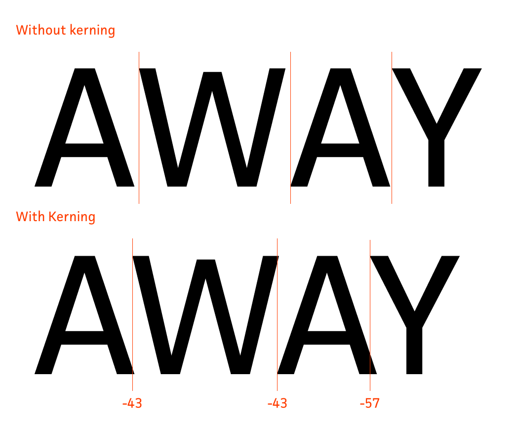 Image Source: Adobe Typekit Blog
Why Use Kerning in Your Web Design?
Spacing plays a vital role in any digital product’s UX/UI. Designers always document spaces between paragraphs, page components, margins, and padding to create an optimal and visually appealing look for the on-page content. Thus, text kerning is also important as it gives your text a specific position on the page and determines your core messages’ legibility.
Kerning Typography Essentials for Good UX
When you start out as a UX/UI designer or hire one to do the job for you, it’s vital to keep kerning in sight. Knowing what it is and how it affects your design will help you check the quality of design work and ask for adjustments if some points are missing. So, let’s make a quick intro to the kerning terminology.
- Kerning values. When doing the kerning process, you will need to assign positive and negative values to the spaces between letters in your text. A positive value means adding some extra space to the already existing space between two letters. A negative value means a deduction of some space from the standard spacing between two letters presupposed by your chosen font’s standard. Every letter has its unique shape and size, so a one-size-fits-all approach won’t do. You will need to adjust spaces for all letter combinations to achieve consistency.
- Kerning tables. If you don’t have time or expertise to design custom kerning for your text, you can always turn to standardized kerning tables carefully prepared for you by other UX/UI designers. These tables contain kerning recommendations for all letter pairings, simplifying the kerning job. However, recommendations may vary for different fonts, and you need to check whether there is a kerning table specifically for your preferred typeface.
Kerning Types
Today, UX/UI designers use four kerning types: metric, optical, manual, and contextual. Here’s how you can apply each of them, focusing on the specific project needs and requirements.
- Metric kerning is the simplest method of doing the kerning job. It involves automated spacing adjustment with the use of kerning tables.
- Optical kerning is a higher-order skill that involves individual space calculations for every letter. You need to use a sophisticated letter size and space calculation algorithm to achieve an optimal visual result.
- Manual kerning is a very time-consuming task that graphic design geeks use to keep every step under control. It’s also relevant for logo design, where you need to design spacing for a few letters.
- Contextual kerning is an automated method of textual adjustment. It considers all text without focusing on every two letters’ pairing. Thus, you get an optimized text quickly.
How to Use Kerning for UX Improvement?
Keep in mind that there are no universal standards for kerning. Thus, every UX/UI designer can use their creativity to craft unique visual designs by playing with kerning. Tightly kerned words create a strong, impactful impression, so they are suitable for energetic slogans and CTAs. Variable kerning suits creative, fun logos and attracts visual attention.
And a couple more tips.
- Fix the problematic pairings first. You can easily get stuck with the kerning task by bringing most letters to order and then facing a troublemaker. So, it’s better to start with the hardest pairs and move on after you’ve found the right spacing for them.
- Mind font size. Nothing can be more frustrating than working on a font for days and then finding out that kerning is messed up with font-size adjustments. Make sure your spacing looks consistent in all sizes.
- Always leave some space. UX/UI designers often overdo minimization of spacing, which looks very hard to read in the end. This problem is especially notable in motion and UX animation designs, where cluttered letters complicate readability to extremes. So, it’s better to give letters some space instead of squeezing them into small spacing norms.
Here you go with a detailed guide on kerning. Use this knowledge to better understand the visual impact of words, instructing your UX/UI designer to create impeccable logos, CTAs, and slogans.